
ggplot2 and contains several different features that we will learn.
ggplot2 and contains several different features that we will learn.
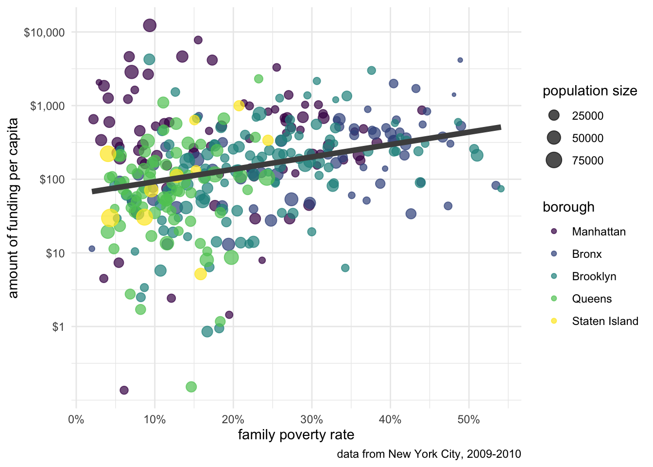
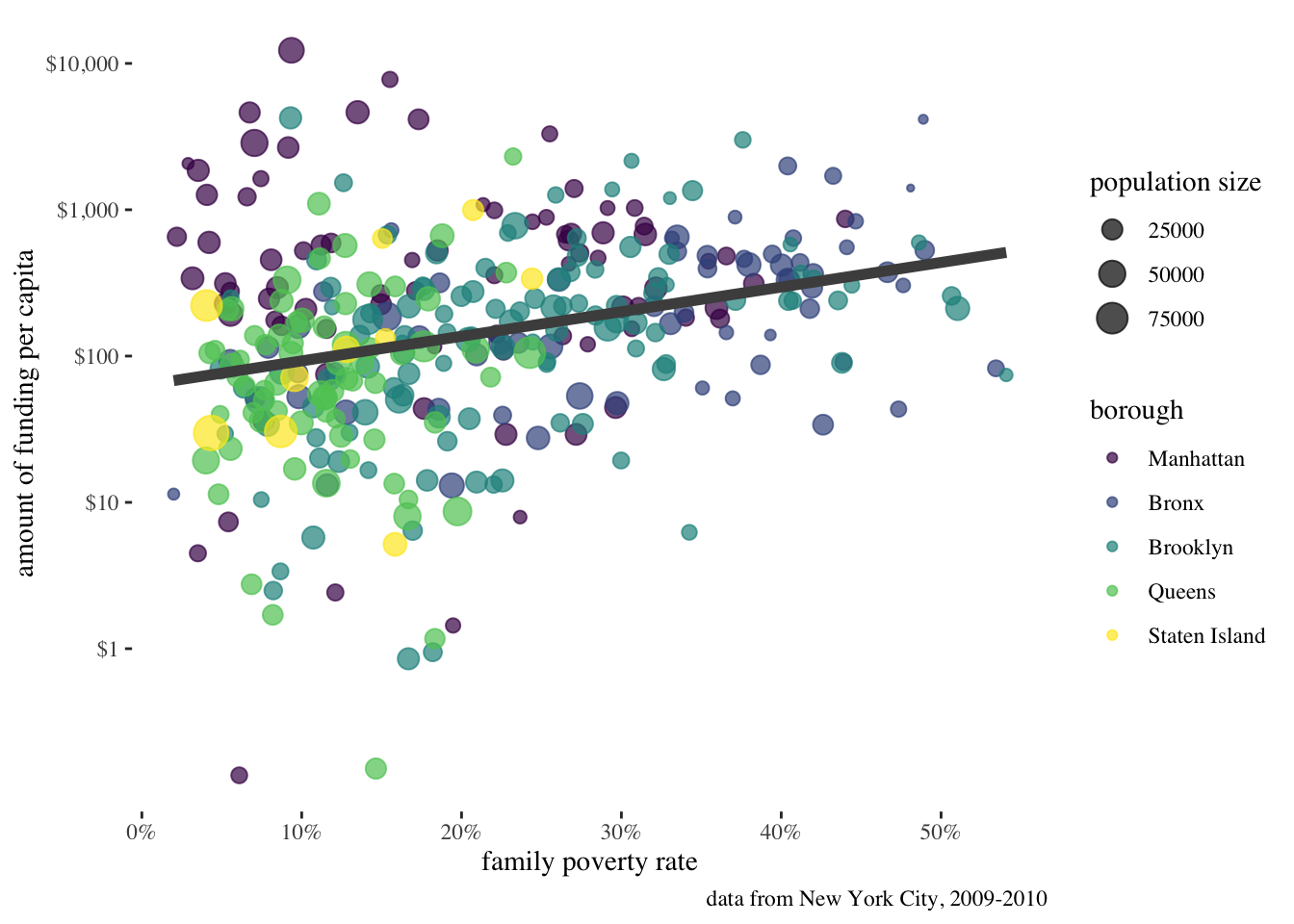
Figure 6.4 shows the relationship between per-capita spending in New York City on social services via non-profit organizations and the poverty rate of the area. The data is based on data collected by Nicole Marwell and I on non-profit contracts for services. Like many other cities, New York City contracts out many of its social services (e.g. substance abuse programs, child care, employment training) to non-profit organization throughout the city. We used data on contracts to analyze the spatial distribution of where this money goes. Figure 6.4 shows that there is a positive relationship between the poverty rate of a health area (an administrative district in NYC) and the amount of funding that health area receives.
Figure 6.4 was produced using the ggplot2 package in R. The figure contains several different features that make a rich and complex plot well beyond a standard scatterplot, including:
All of these things are possible, and indeed, relatively easy within the framework of ggplot2. We are going to learn how to use ggplot2 by building up this plot one layer at a time.
To make this plot, we will use a health area based dataset with the necessary information that you can find here. You can also load it into R directly with this command.
load(url("https://github.com/AaronGullickson/practical_analysis/raw/master/data/nyc.RData"))The name of the dataset in R is nyc. Lets take a look at it:
nyc# A tibble: 341 × 7
health_area amtcapita poverty unemployed income borough popn
<int> <dbl> <dbl> <dbl> <dbl> <fct> <dbl>
1 10110 29.2 0.228 11.3 40287. Manhattan 27983.
2 10120 109. 0.226 10.2 43266. Manhattan 20235.
3 10210 216. 0.301 11.6 29016. Manhattan 28688.
4 10221 29.1 0.272 17.3 33988. Manhattan 27161.
5 10222 2.42 0.121 8.58 66351. Manhattan 13373.
6 10300 507. 0.274 13.6 32592. Manhattan 16036.
7 10400 678. 0.315 16.2 31252. Manhattan 29905.
8 10500 44.5 0.296 16.1 32579. Manhattan 27705.
9 10610 141. 0.222 12.5 34785. Manhattan 16294.
10 10620 137. 0.263 6.92 36097. Manhattan 14411.
# … with 331 more rowsThe x value we want to use here is poverty which is the proportion of families in poverty in the health area. The y value we want to use is amtcapita which is the amount of funding per capita in the health area. The borough factor variable identifies the borough of the health area. The popn variable gives the population size of the health area.
You create a plot in ggplot2 by combining together multiple layers to add greater complexity. So, you can start with a very basic graph and then add embellishments in additional layers as needed to improve the plot. Because of this modular nature, ggplots encourage experimentation.
Most of the layers in ggplot2 come in four types of functions that can all be identified by the first part of their name:
geom_geom_point which, as the name implies, plots points on the graph in the fashion of a scatterplot. However, there are many other options for geoms, including geom_bar, geom_histogram, geom_boxplot, geom_line and so on. Furthermore, you can add more than one geometry to the same plot. The best-fitting black line in Figure 6.4 is from the geom_smooth function and it is plotted on top of the points.
scale_scale_color_manual to manually assign colors to the palette or scale_color_brewer to assign a certain predefined palette. The use of a logarithmic scale on the y-axis is done through a scale_y_log10 function.
theme_theme_bw which gives a sharper black and white contrast than the default theme. Several other themes ship with ggplot2 and you can get additional themes from packages like ggthemes. If you want to really get into it, you can also use the base theme() command to specify particular look-and-feel issues or to create your entirely new theme.
coord_coord_cartesian setting which plots a two dimensional x and y axis plot. The most common way you will see coord_ commands is if you want to flip the display of the x and y coordinates with coord_flip() or if you are plotting actual spatial data and you need to use some kind of map projection.
To get started with a plot, lets just use the basic ggplot command which will begin every ggplot:
ggplot(nyc, aes(x=poverty, y=amtcapita))
ggplot command will create a canvas that we can draw upon, but isn’t very interesting by itself.
As Figure 5.2 shows, this basic ggplot just creates the canvas upon which we will paint our masterpiece. The first argument to the ggplot command is always the data that will be plotted. The second argument is always a list of aesthetics for the plot which are defined by the aes command. Aesthetics are a core concept in creating a ggplot. Later functions will use those aesthetics when applicable.
You might ask how ggplot new the minimum and maximum values for the x and y axis. It knew this because we defined the x and y aesthetics in the aes command. We always assign variable names from our dataset to various aesthetics. These aesthetics were then used by ggplot to determine maximum values for the x and y axis. Importantly as I add additional layers to the plot, those layers will inherit any aesthetics that I defined here.
To see how that works, lets add the first layer to the plot. The core geometry here is geom_point which will make my scatterplot. To add additional functions to the plot, we use the “+” command to literally add the additional function to whatever is already there. By convention, each new layer is added on a new indented line.
ggplot(nyc, aes(x=poverty, y=amtcapita))+
  geom_point()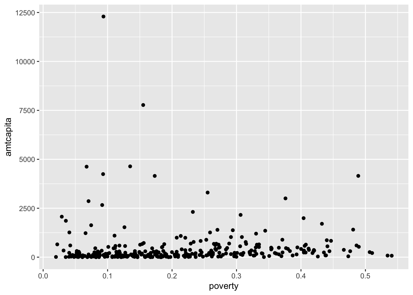
ggplot with geom_point. Because this variable is heavily right-skewed, most of the points are “scrunched” together at the bottom.
The geom_point function expects an x and y aesthetic to be defined. In this case, it inherits those aesthetics from the initial ggplot command and is able to place all the points on my scatterplot. The plot doesn’t look great because of the right-skewness of the funding amount, but we will deal with that later.
Now lets think about additional aesthetics we might want to add to this plot. The obvious choice here is to add color to the points to reflect the borough of each health area. Since borough is a categorical variable in the dataset, we can simply add the color aesthetic to the ggplot command:
ggplot(nyc, aes(x=poverty, y=amtcapita, color=borough))+
  geom_point()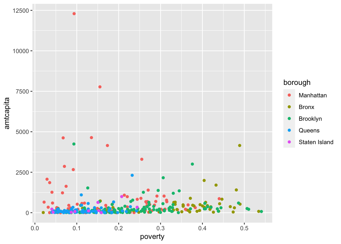
color=borough to the top-level aesthetics leads to a more colorful plot.
Now the plot has a lot more pop. Because the color aesthetic was defined in the top-level ggplot, it was carried forward into geom_point and each dot was then given a different color based on its borough level. Note that the final plot also now includes a handy legend.
Importantly, whenever you define an aesthetic in the top-level ggplot command, it will be carried forward into all layers of that plot. This can become important as we add other layers. For example, lets now try to add the best-fitting straight line to this graph. We do that with the geom_smooth command with the argument method="lm" which tells it to fit a straight line (as opposed to a curvy one).
ggplot(nyc, aes(x=poverty, y=amtcapita, color=borough))+
  geom_point()+
  geom_smooth(method="lm", se=FALSE)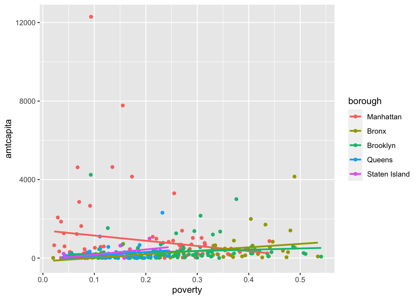
Figure 5.5 isn’t exactly what I expected. Instead of one line for all of the points, I end up with five different colored lines for the five boroughs. That is because the geom_smooth is also inheriting the top-level aesthetics and so it dutifully draws five different lines.
If, I want just a single line, then I can instead define the color aesthetic within geom_point only, instead of at the top level:
ggplot(nyc, aes(x=poverty, y=amtcapita))+
  geom_point(aes(color=borough))+
  geom_smooth(method="lm", se=FALSE)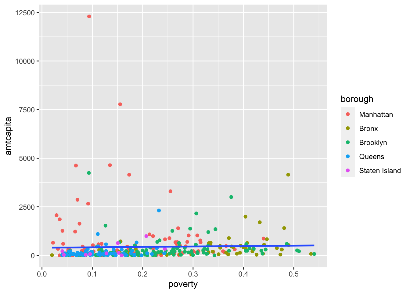
color aesthetic only within geom_point, I limit its use to just that layer.
Now, I get just a single line because the color aesthetic is no longer inherited by geom_smooth. Lets go a little further with this approach and also add the size aesthetic to geom_point alone.
ggplot(nyc, aes(x=poverty, y=amtcapita))+
  geom_point(aes(color=borough, size=popn))+
  geom_smooth(method="lm", se=FALSE)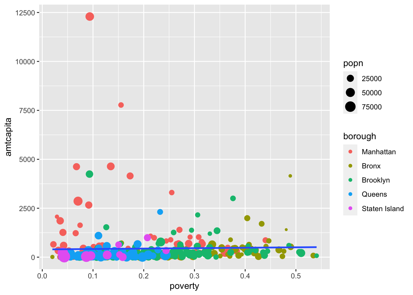
color aesthetic only within geom_point, I limit its use to just that layer.
We are resizing each of the figures relative to the size of the population. This will help draw our eye to larger health areas, an away from outliers that might be driven by small size. Notice that this also creates another legend for us.
I want to make one more small change before proceeding to the next section. I am getting a lot of overplotting of the points because they are so scrunched up at the bottom of the plot. One way to address this problem is to add semi-transparency to the points so that I can see the density of points. You can add transparency to a geometry with the alpha argument. You set this argument with a value between 0 (full transparency) and 1 (full opacity). Lets try that with the existing plot:
ggplot(nyc, aes(x=poverty, y=amtcapita))+
  geom_point(aes(color=borough, size=popn), alpha=0.7)+
geom_smooth(method="lm", se=FALSE)alpha argument in geom_point adds some transparency to the points. We can make them even more transparent by lowering the value closer to zero.
In this case, the transparency is not helping that much because of the heavy right-skew, but we are going to address that problem in the next section.
The plot has improved as I have added elements, but it still has one major problem. Because the funding variable is heavily right-skewed, most of the points are bunched up at the bottom and its quite diffult to undertand what the pattern actually looks like. The most common solution for this kind of problem is to transform the axis from a linear scale where each equidistance change reflects an additive change in the value of the variable to a logarithmic scale where each equidistance change reflects a multiplicative change in the value of the variable. I can do this using a “scale” commands.
Scale commands are always tied to a corresponding aesthetic and allow you to make alterations to the way that aesthetic is displayed in the graph. In general, scale commands always start with scale_<name of aesthetic>_. In this case, the default scale for my y-axis is scale_y_continuous() because the y aesthetic is a numeric variable. To change this to a logarithmic scale, I simply need to replace it with scale_y_log10():
ggplot(nyc, aes(x=poverty, y=amtcapita))+
  geom_point(aes(color=borough, size=popn), alpha=0.7)+
  geom_smooth(method="lm", se=FALSE)+
  scale_y_log10()
That made a pretty dramatic difference in the look of the graph! I can now much more easily see the positive relationship between the two variables. However, I need to remember that its not a linear relationship, because of the scale change to y. Instead, the relationship is exponential.
Since, I am already here, I want to make an adjustment to the default tickmarks that are being shown on the y-axis. I only get tickmarks for 1, 100, and 10,000. I would like additional tickmarks at 10 and 1000 to better see the exponential increase by a factor of ten. Furthermore, I would like to also indicate that these are dollar amounts by putting a “$” in front of those tickmark values.
Each of the scale_y_* and scale_x_* commands have arguments that allow you to control tickmarks. The breaks argument will allow me to specify what tickmark values I want to use:
ggplot(nyc, aes(x=poverty, y=amtcapita))+
  geom_point(aes(color=borough, size=popn), alpha=0.7)+
  geom_smooth(method="lm", se=FALSE)+
  scale_y_log10(breaks=c(1, 10, 100, 1000, 10000))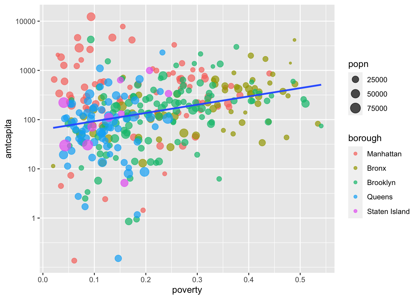
scale_y_ command to set tickmark values manually.
That looks better to me, but I still want the dollar sign in front to help the reader understand how this variable is being measured. You can also specify a labels argument that is of the same length as breaks but a character vector that actually shows how the tickmarks will be displayed. There are a couple of ways that I can do this, but the easiest approach is to use the handy scales package which is built to handle these types of cases. From that scales package, I can just use the dollar function to convert my numeric values into a nice tickmark display.
ggplot(nyc, aes(x=poverty, y=amtcapita))+
  geom_point(aes(color=borough, size=popn), alpha=0.7)+
  geom_smooth(method="lm", se=FALSE)+
  scale_y_log10(breaks=c(1, 10, 100, 1000, 10000),
                labels=scales::dollar(c(1, 10, 100, 1000, 10000)))
scale_y_ command to give my tickmarks a nice look. Note that the scales::dollar function adds both a thousands comma marker and the dollar sign in front.
Its worthwhile to take the time to adust your tickmarks for a nice display because it can really help a reader to orient themselves to what is being measured in your plot.
In that regard, lets go ahead and adjust the tickmarks on the x-axis as well. The poverty rate is measured as the proportion of households, so I would like to convert this to a percent and have a “%” displayed at the end. In this case, I don’t want to change the scale of the axis or the tickmark values, so I am just going to change the labels value of the default scale_x_continuous command. Luckily the scales package has me covered with the percent command.
ggplot(nyc, aes(x=poverty, y=amtcapita))+
  geom_point(aes(color=borough, size=popn), alpha=0.7)+
  geom_smooth(method="lm", se=FALSE)+
  scale_y_log10(breaks=c(1, 10, 100, 1000, 10000),
                labels=scales::dollar(c(1, 10, 100, 1000, 10000)))+
  scale_x_continuous(labels=scales::percent)
scales::percent to the labels argument of my scale_x_ command, the existing proportions will be properly turned into percents.
Note that in this case, all I had to do was feed in the scales::percent function directly as the labels argument and ggplot knew what to do. If you don’t need to change the values of your tickmarks, this is the quickest way to transform your tickmarks. I could have done this above with scales::dollar but I wanted to also add in some tickmarks, so I had to give a fuller specification.
You may be wondering how ggplot determined the specific colors used when we specified a color aesthetic. We didn’t actually specify which colors should be used only that color should be used to differentiate boroughs. Ggplot used its default color palette, which is … fine. But what if we want more control over color choices.
The color palette is controlled by scale_color_* commands. The most direct approach would be to use scale_color_manual to define the specific colors that we want.
ggplot(nyc, aes(x=poverty, y=amtcapita))+
  geom_point(aes(color=borough, size=popn), alpha=0.7)+
  geom_smooth(method="lm", se=FALSE)+
  scale_y_log10(breaks=c(1, 10, 100, 1000, 10000),
                labels=scales::dollar(c(1, 10, 100, 1000, 10000)))+
  scale_x_continuous(labels=scales::percent)+
  scale_color_manual(values=c("thistle","steelblue","moccasin","salmon",
                              "seagreen"))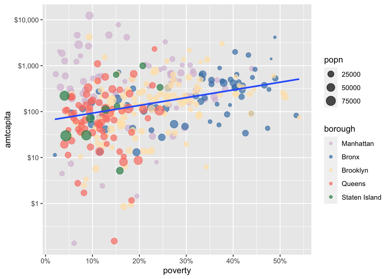
scale_color_manual to specify specific values for your color palette. R has 657 built-in color names to choose from. You can see the full list of color names by running colors(). If you don’t like these options, you can specify colors by hexidecimal code.
While designing your own color palettes can be a lot of fun, you are usually better off working with pre-defined color palettes. In part, this is because you want to ensure that you are using colorblind safe color palettes. You can get pre-defined color palettes with the scale_color_brewer command. Here you just choose a palette name from among a list you can find in the help file (accessed by ?scale_color_brewer). Lets try the “Dark2” option.
ggplot(nyc, aes(x=poverty, y=amtcapita))+
  geom_point(aes(color=borough, size=popn), alpha=0.7)+
  geom_smooth(method="lm", se=FALSE)+
  scale_y_log10(breaks=c(1, 10, 100, 1000, 10000),
                labels=scales::dollar(c(1, 10, 100, 1000, 10000)))+
  scale_x_continuous(labels=scales::percent)+
  scale_color_brewer(palette="Dark2")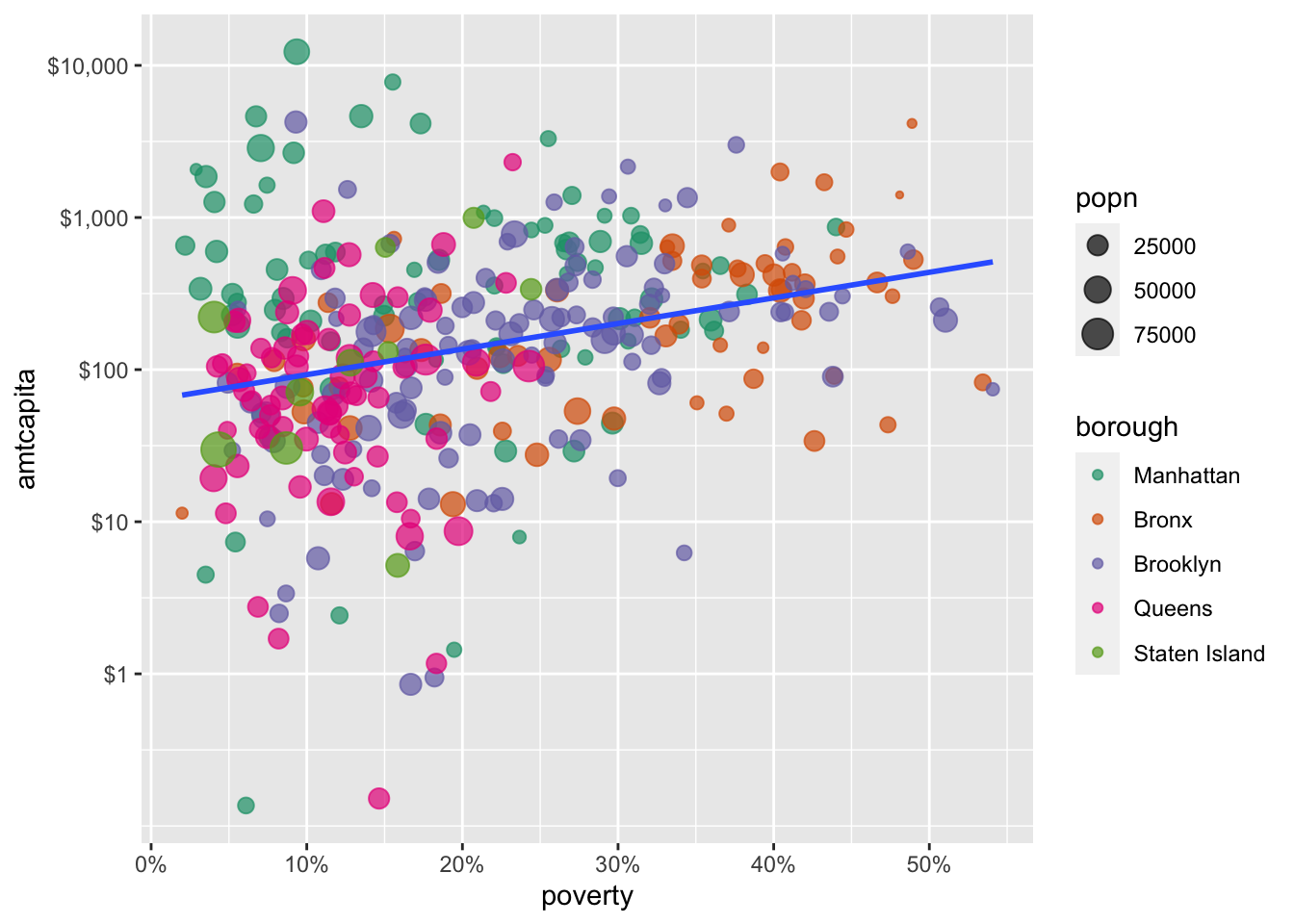
scale_color_brewer provids a nice contrast and some greater weight to my points. You can see all of the palette options by accessing the help file for scale_color_brewer.
Another built-in option for color palettes is the viridis color palette which aims to give a high quality and high contrast color palette that is both color blind safe and usable in greyscale. You can access the viridis color palette with scale_color_viridis_d():
ggplot(nyc, aes(x=poverty, y=amtcapita))+
  geom_point(aes(color=borough, size=popn), alpha=0.7)+
  geom_smooth(method="lm", se=FALSE)+
  scale_y_log10(breaks=c(1, 10, 100, 1000, 10000),
                labels=scales::dollar(c(1, 10, 100, 1000, 10000)))+
  scale_x_continuous(labels=scales::percent)+
  scale_color_viridis_d()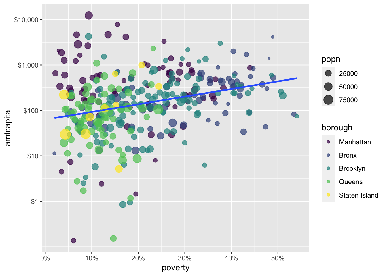
scale_color_viridis_d() function will use the professional quality viridis color scale. This scale is colorblind safe to use.
Of course, one of the great things about R is that anybody can make a package and people have made many, many packages focused on color palettes. If you install these packages, you will gain access to those color palettes, although sometimes you have to read the package details to know how to implement them. Some of my favorites are:
As an example, I am going to use one of the Wes Anderson palettes for Moonrise Kingdom (which is obviously the best Wes Anderson movie). I can get a preview of this color palette with the wes_palette function:
wesanderson::wes_palette("Moonrise3")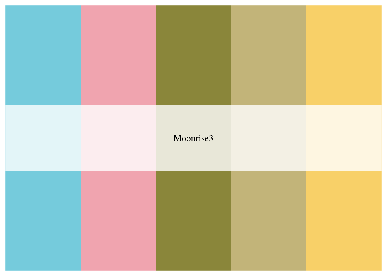
In this case, I needed a color palette with at least five options which is why I chose “Moonrise3” (Moonrise1 and Moonrise2 only have four colors in the palette).
To use this palette, I just need to feed in wes_palette as values in scale_color_manual.
ggplot(nyc, aes(x=poverty, y=amtcapita))+
  geom_point(aes(color=borough, size=popn), alpha=0.7)+
  geom_smooth(method="lm", se=FALSE)+
  scale_y_log10(breaks=c(1, 10, 100, 1000, 10000),
                labels=scales::dollar(c(1, 10, 100, 1000, 10000)))+
  scale_x_continuous(labels=scales::percent)+
  scale_color_manual(values = wesanderson::wes_palette("Moonrise3"))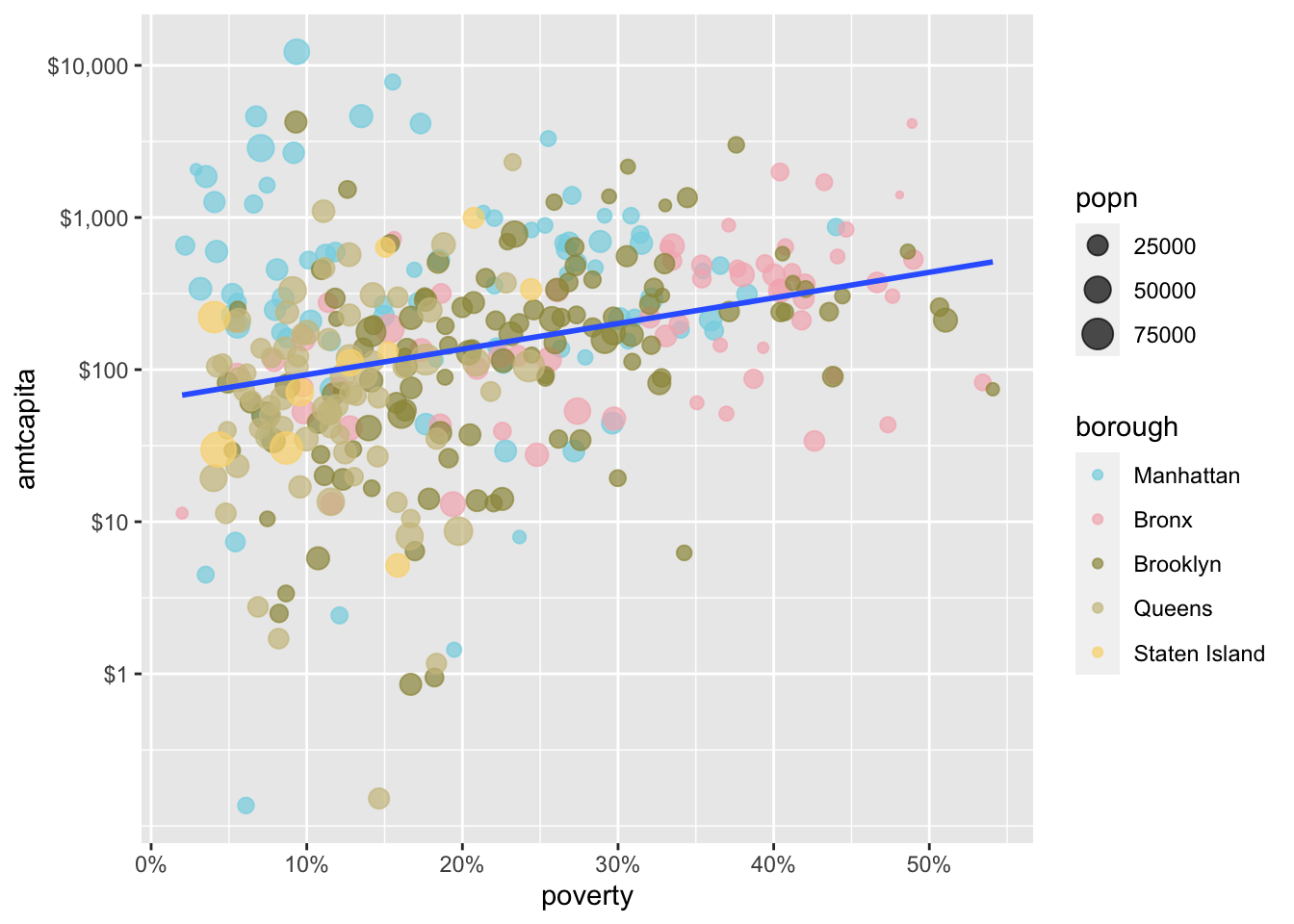
While this is pretty neat, I will use the more formal viridis palette for the remainder of this chapter.
You can also use color in a non-aesthetic direct way. For example, I don’t really like the blue color of that best-fitting line. I can specify an exact color for this line by specifying a color in the color argument used outside of the aes command.
ggplot(nyc, aes(x=poverty, y=amtcapita))+
  geom_point(aes(color=borough, size=popn), alpha=0.7)+
  geom_smooth(method="lm", se=FALSE, color="grey30", size=2)+
  scale_y_log10(breaks=c(1, 10, 100, 1000, 10000),
                labels=scales::dollar(c(1, 10, 100, 1000, 10000)))+
  scale_x_continuous(labels=scales::percent)+
  scale_color_viridis_d()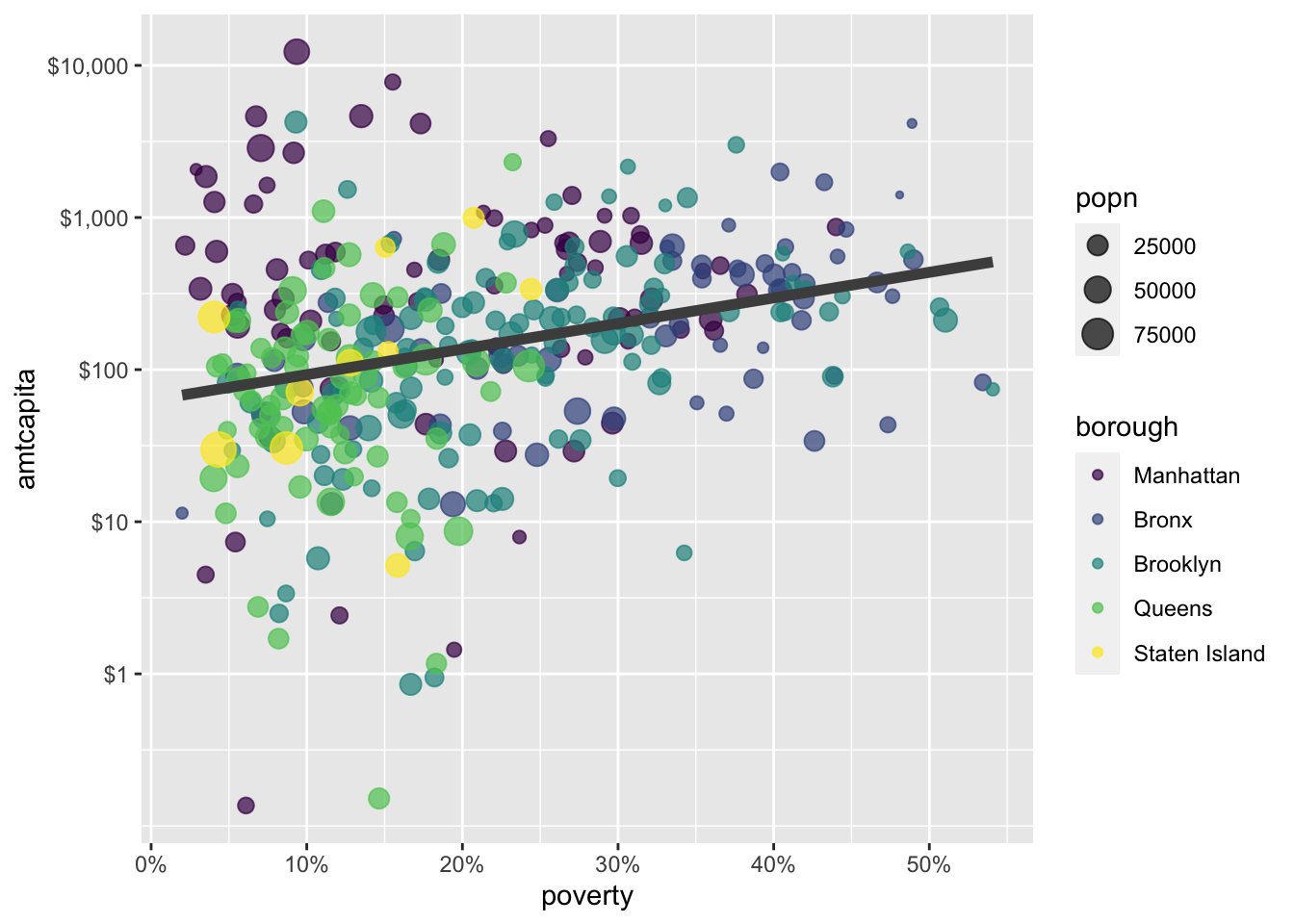
color argument outside of the aes command, as I have done here with geom_smooth. Note that I also increased the size of this geometry a little bit.
Remember to always label your graphs well. By default each of your aesthetics will be labeled by the name of the variable itself which is not always very helpful. We can figure out “borough” just fine but “popn” and “amtcapita” are somewhat inscrutable to the reader. Even “poverty” is vague - what about poverty? What are we actually measuring. You should take the time to ensure that all labels are self-explanatory.
You can control all of these labels with the labs command. Most of the arguments to the labs command are keyed to an aesthetic. So, if we want to change the label on the legend for size, we use size as an argument. Lets go ahead and use the labs command to put nice labels on the figure.
ggplot(nyc, aes(x=poverty, y=amtcapita))+
  geom_point(aes(color=borough, size=popn), alpha=0.7)+
  geom_smooth(method="lm", se=FALSE, color="grey30", size=2)+
  scale_y_log10(breaks=c(1, 10, 100, 1000, 10000),
                labels=scales::dollar(c(1, 10, 100, 1000, 10000)))+
  scale_x_continuous(labels=scales::percent)+
  scale_color_viridis_d()+
  labs(x="family poverty rate",
       y="amount of funding per capita",
       size="population size",
       caption="data from New York City, 2009-2010")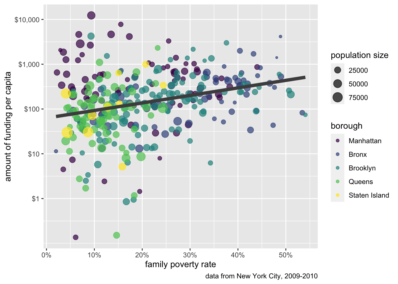
labs command can be used to add nice labeling to your figure. Most of the arguments in the labs command are keyed to a corresponding aesthetic.
Notice that I try to use a consistent approach to my labeling - all lower-case. Since the color aesthetic was already well-labeled, I didn’t add it here, but I did apply better labels to my x-axis, y-axis, and size legend. Additionally, I added what ggplot calls a “caption.” This bit of labeling appears at the bottom of the graph and is useful for indicating a data source. I note that the labs argument will also take a title and subtitle to figures. I don’t show that here because we will learn a better way to properly caption figures in Chapter 6.
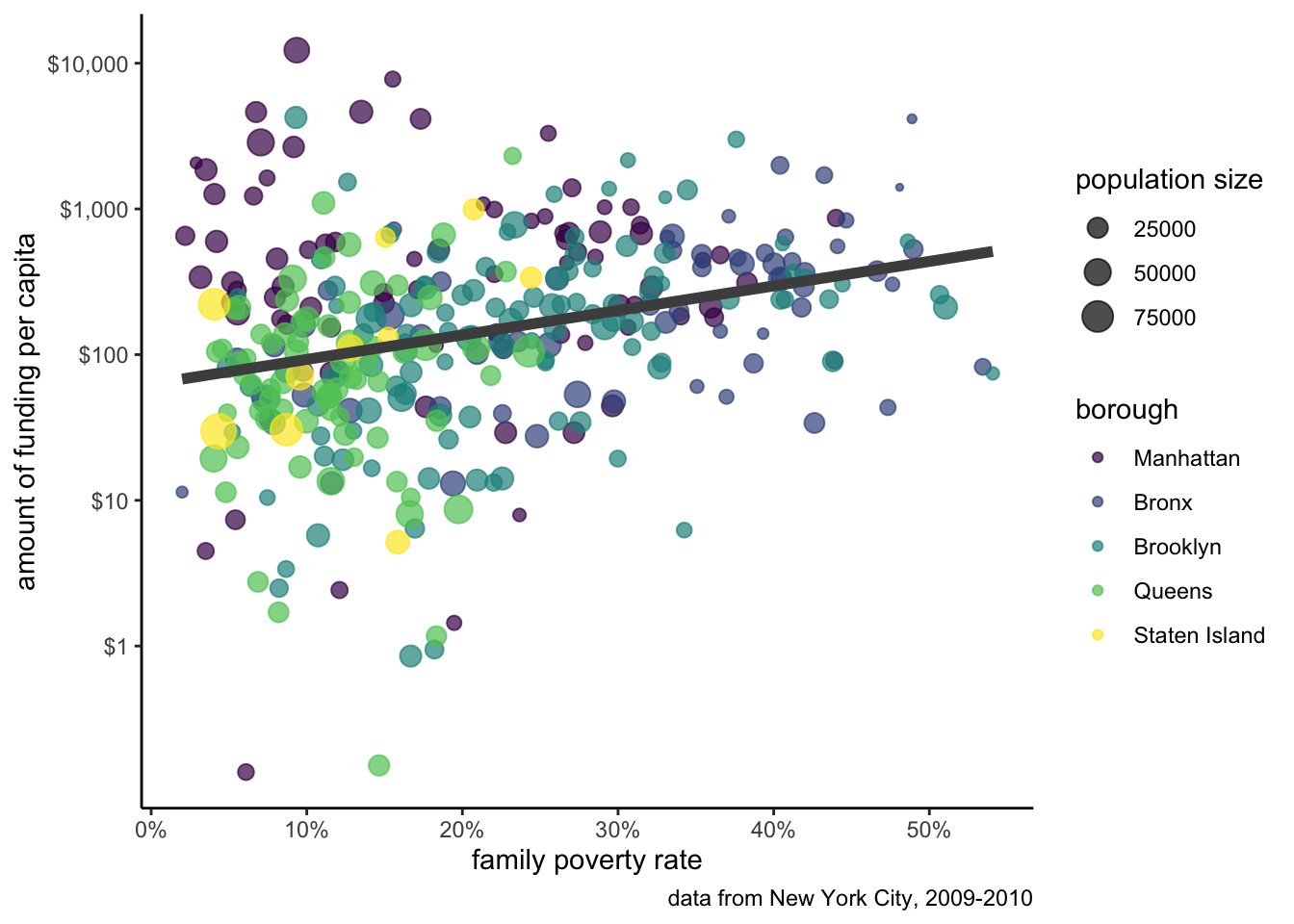
Our figure is really coming together. The last step is to decide on a theme. Right now, we are using the default ggplot theme which uses a grey canvas background with minor and major grid lines at the tickmarks of both axes. However, if we don’t care for the look of this theme, ggplot ships with several other themes to choose from. My personal favorite is theme_bw() which gets rid of the gray and provides more white/black contrast. To change the theme, just add your chosen theme to the ggplot code:
ggplot(nyc, aes(x=poverty, y=amtcapita))+
  geom_point(aes(color=borough, size=popn), alpha=0.7)+
  geom_smooth(method="lm", se=FALSE, color="grey30", size=2)+
  scale_y_log10(breaks=c(1, 10, 100, 1000, 10000),
                labels=scales::dollar(c(1, 10, 100, 1000, 10000)))+
  scale_x_continuous(labels=scales::percent)+
  scale_color_viridis_d()+
  labs(x="family poverty rate",
       y="amount of funding per capita",
       size="population size",
       caption="data from New York City, 2009-2010")+
  theme_bw()
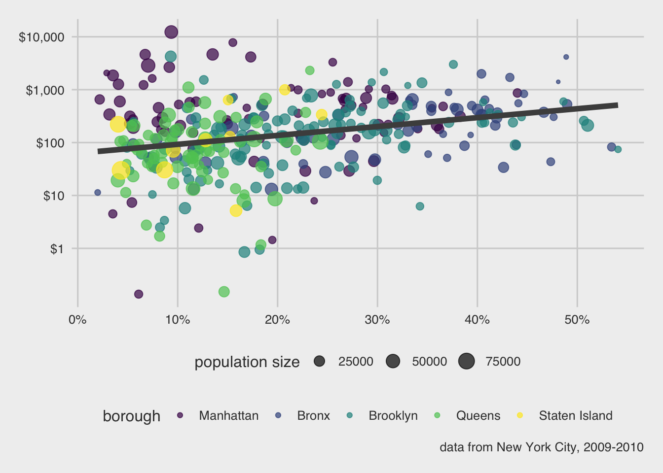
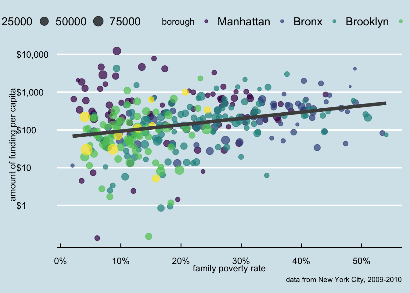
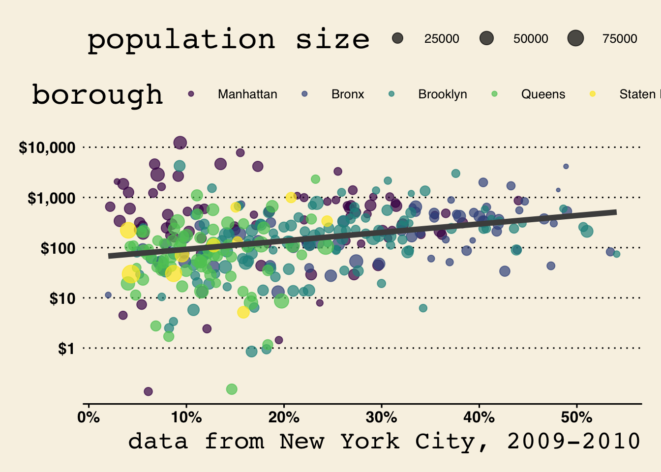
Figure 5.20 shows the other themes available to us in ggplot.

ggplot2.
The ggthemes package includes some additional themes that you can use, some of which are visualized in Figure 5.21.
ggthemes package.
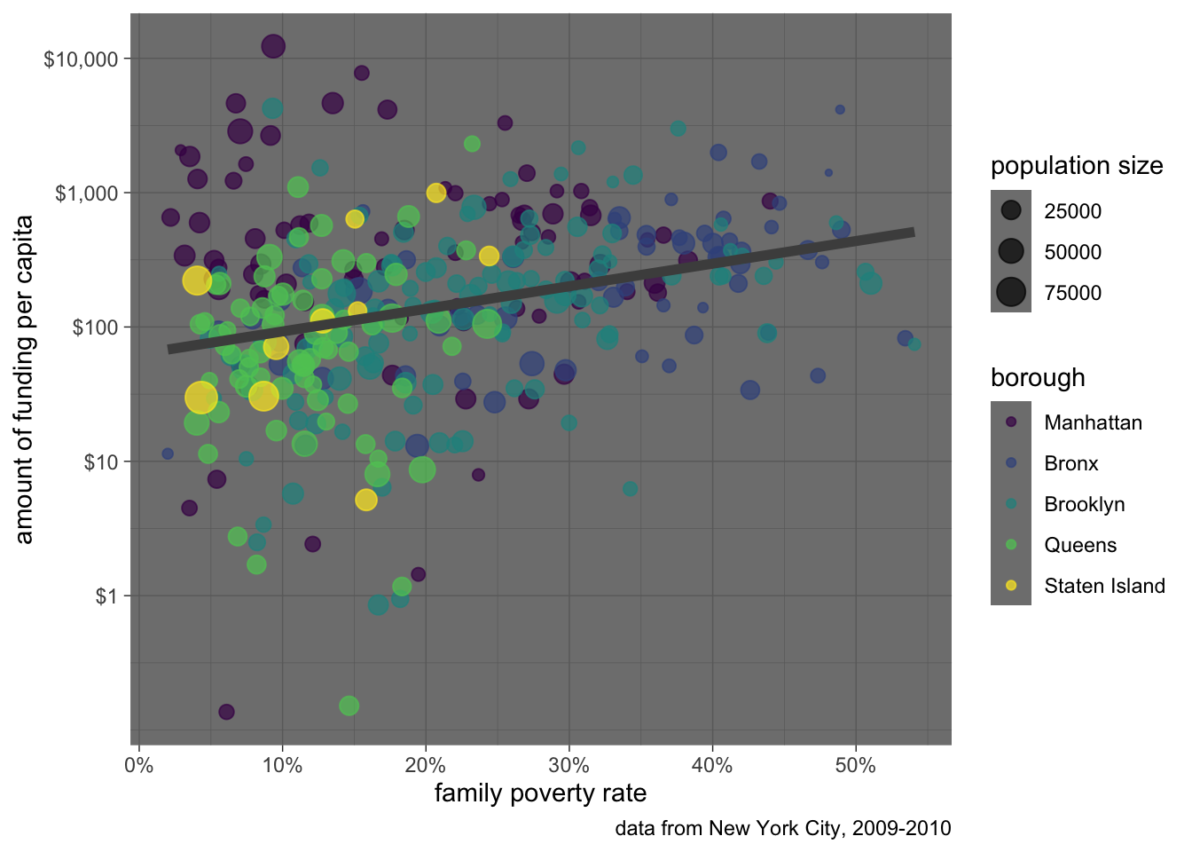
You can also change specific elements with the theme command. The help file for the theme command will show you the very long list of parameters that can be adjusted. If you really want to go crazy you can use it to create your own custom theme. The more common use is to use the theme command to alter the behavior of another theme. Let me do that now to move the legend to the bottom of the graph and to remove gridlines:
ggplot(nyc, aes(x=poverty, y=amtcapita))+
  geom_point(aes(color=borough, size=popn), alpha=0.7)+
  geom_smooth(method="lm", se=FALSE, color="grey30", size=2)+
  scale_y_log10(breaks=c(1, 10, 100, 1000, 10000),
                labels=scales::dollar(c(1, 10, 100, 1000, 10000)))+
  scale_x_continuous(labels=scales::percent)+
  scale_color_viridis_d()+
  labs(x="family poverty rate",
       y="amount of funding per capita",
       size="population size",
       caption="data from New York City, 2009-2010")+
  theme_bw()+
  theme(legend.position = "left", panel.grid = element_blank())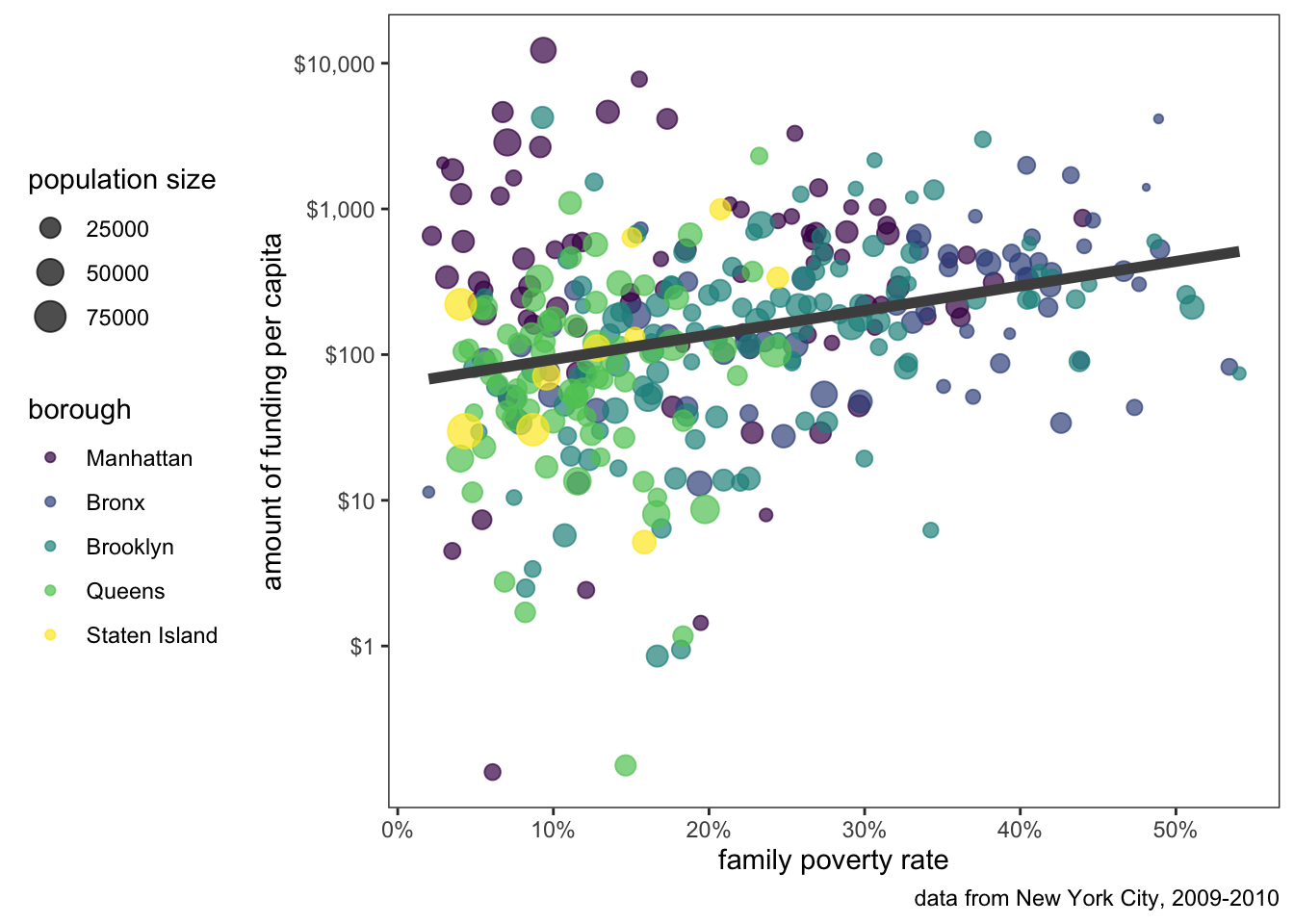
In many cases, your x-axis will be a categorical variable and the tickmarks will identify different categories. This is true of basic barplots and comparative boxplots, for example. One common problem with this approach is that long category labels may start overlapping due to a lack of room. Lets make a comparative boxplot of movie run time from the movies data by genre to see the problem:
load(url("https://github.com/AaronGullickson/stat_data/raw/main/output/movies.RData"))

ggplot(movies, aes(x=reorder(genre, runtime, median), y=runtime))+
  geom_boxplot(fill="grey")+
  theme_bw()+
  labs(y="movie runtime in minutes", x=NULL)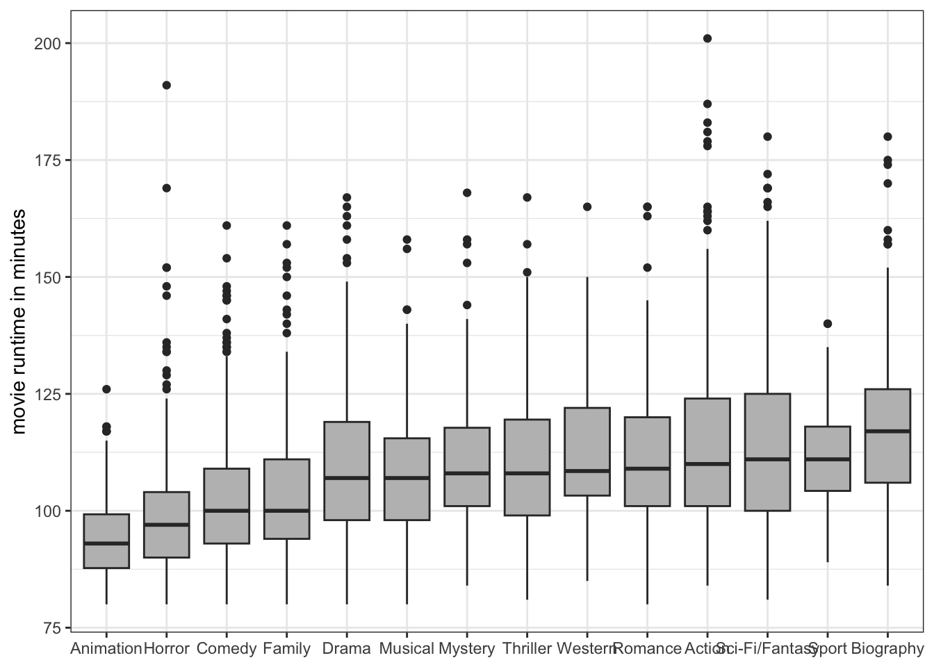
As Figure 5.23 shows, some of the genre labels are running into other ones. There simply isn’t enough room to fit them all in. You could go deep into the themes function to find the parameter to align labels at an angle, but a simpler solution is to just use coord_flip to reverse the placement of your x and y axis:
load(url("https://github.com/AaronGullickson/stat_data/raw/main/output/movies.RData"))

ggplot(movies, aes(x=reorder(genre, runtime, median), y=runtime))+
  geom_boxplot(fill="grey")+
  coord_flip()+
  theme_bw()+
  labs(y="movie runtime in minutes", x=NULL)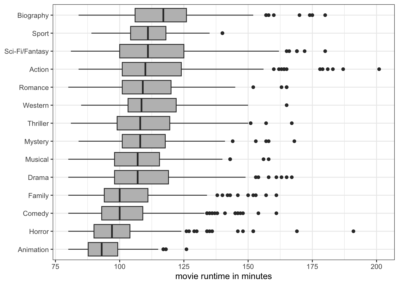
coord_flip(), we ensure that there is enough room in the margins to display each genre name fully.
As Figure 5.24 shows, the genre names will now have no problem with overlap because they each show up on their own row and ggplot will always ensure there is enough room in the margins to list each label.
Probably the most common mistake when using ggplot is to forget the “+” sign that connects each command together to form the whole figure. If you do this, the figure will end at the point where there is no “+” and the remaining commands will be run separately and likely give you errors or odd results. for example:
ggplot(nyc, aes(x=poverty, y=amtcapita))+
  geom_point(alpha=0.7, aes(color=borough, size=popn))+
  geom_smooth(method="lm", color="black", se=FALSE, size=1.5)+
  scale_x_continuous(label=scales::percent)+
  scale_y_log10(breaks=c(1, 10, 100, 1000, 10000),
                labels=scales::dollar(c(1, 10, 100, 1000, 10000)))+
  scale_color_viridis_d()+
  theme_bw()
  labs(x="family poverty rate",
       y="amount of funding per capita",
       caption="data from New York City, 2009-2010",
       size="population size")
$x
[1] "family poverty rate"
$y
[1] "amount of funding per capita"
$size
[1] "population size"
$caption
[1] "data from New York City, 2009-2010"
attr(,"class")
[1] "labels"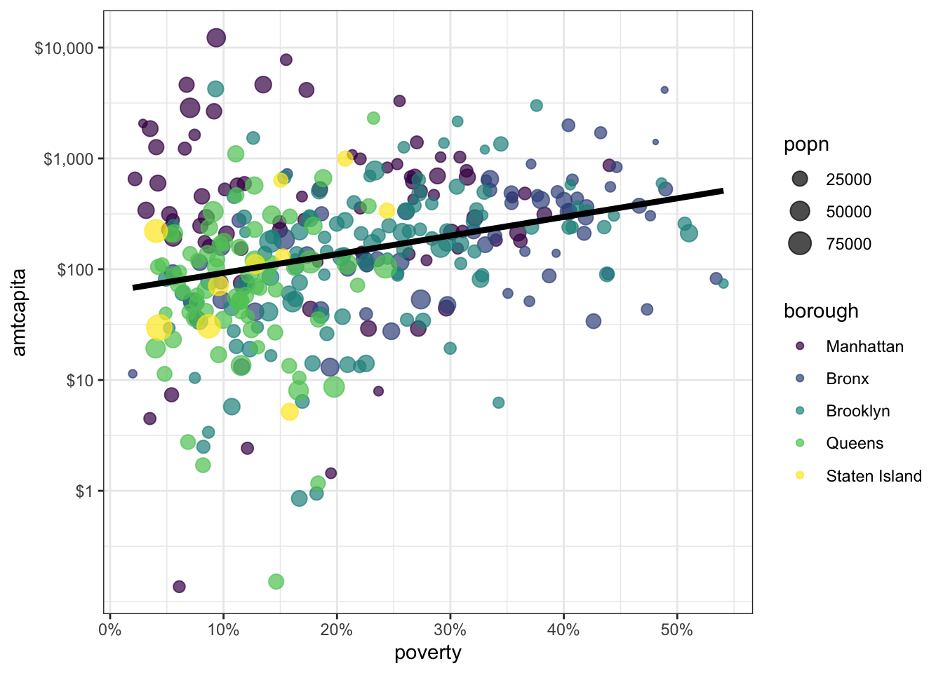
labs command was not connected to the rest of the ggplot by a “+” sign so instead of being applied to the plot, those labels are just printed to the screen.
The automatic indenting should give you a hint that a “+” sign is missing. Ideally, this should be obvious when you hit return, but sometimes the “+” sign is missing because you add a layer in the middle somewhere and forget a “+” sign. You can use Ctrl+I (or Command+I on Mac) to check that the indenting is working as you expected.
In Figure 6.4, I used color to distinguish health areas in different boroughs. This use of aesthetics add another dimension to the figure. Another way to accomplish this same thing is faceting. When you facet, you split a basic graph into a sequence of panels where each panel is a separate category of some categorical variable. This approach is also called a “small multiple.” Lets try that with the NYC data.
ggplot(nyc, aes(x=poverty, y=amtcapita))+
  geom_point(alpha=0.4, aes(size=popn))+
  geom_smooth(method="lm", color="black", se=FALSE, size=1.5)+
  scale_x_continuous(label=scales::percent)+
  scale_y_log10(breaks=c(1, 10, 100, 1000, 10000),
                labels=scales::dollar(c(1, 10, 100, 1000, 10000)))+
  facet_wrap(~borough)+
  theme_bw()+
  labs(x="family poverty rate",
       y="amount of funding per capita",
       caption="data from New York City, 2009-2010",
       size="population size")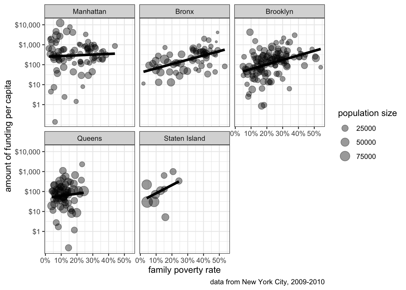
The scatterplot for each borough now shows up in a separate panel. Because the boroughs are separated, I can more clearly see the relationship for each borough than with the color case. Generally, any categorical variable that you want to add with an aesthetic can also be done through faceting. If you want to add even more dimensionality to your figure, you can use both an aesthetic like color and faceting to get multiple dimensions into your figure.
The ggplot2 framework is designed to encourage exploration and playfulness, You can make an incredible variety of figures using ggplot2 once you learn to speak its grammar. To help get you started, you can view the plotting cookbook in this textbook’s companion textbook, which provides basic starter code for a variety of basic plot types. I would also recommend Kieran Healy’s fantastic Data Visualization book which uses ggplot2.